We made it happen! Winner of German Brand Award for our successful corporate rebranding
Initiated by Germany's design and brand authority, and judged by a top-class panel of experts from brand management and brand science: The German Brand Award is the award for successful brand management in Germany. It discovers, presents, and awards unique brands and brand-makers - not only promoting the winners but also their respective industries.
Characteristic of the new design for the Scout24 Group is a digital highlighter style that underlines, circles, and marks what is most important. Instead of the classic newspaper advertisement, this now takes place on the digital surface. Scout24 is thus consistently developing its brand image further - and still remains true to its own roots.
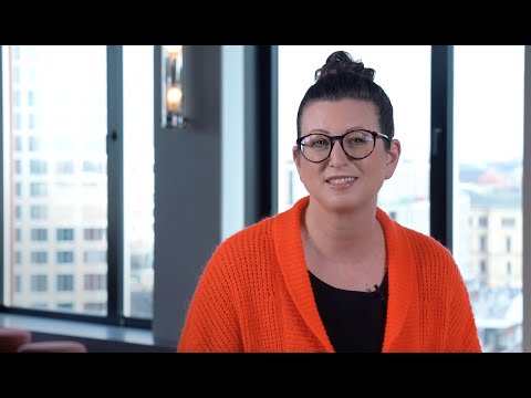
To learn more about the story behind the new brand redesign, we spoke with Kerstin Ludwig, Senior Art Director for Corporate Design & Brand at Scout24. She has been the Project Manager Creation throughout this exciting rebranding planning, process and rollout. Here's what she had to say:
Related Files

Why did Scout24 decide to redesign its brand?
Kerstin: We have been active with our online marketplaces for over 20 years. During this time, media usage behaviour and viewing habits have changed considerably. In the meantime, we have only slightly modified our corporate design in the past years.
Our previous look and feel had become outdated over time. The design was functional but unemotional. We were missing a clear and meaningful positioning, and a contemporary look to also appeal to younger target groups.
In order to continue to offer a state-of-the-art user experience on our marketplaces in the future, we decided to implement the most comprehensive redesign in the company's history. Therefore, we not only created new logos but also redesigned the whole look and feel including images, illustrations, and typography.

Senior Art Director for Corporate Design & Brand at Scout24
What is the story behind the new design - and what does it stand for?
Kerstin: Our aim was to create an emotional link to customers and consumers to strengthen first choice and satisfaction. We wanted to improve the differentiation to our competitors. We wanted to improve our position as an employer brand by reflecting to the outside what we stand for. AND we wanted to display to the outside that we are evolving on the inside.
Now, we highlight what is important. What makes sense. Point out. Narrow it down. Every brand in the Scout24 Group uses its own unique colours for this. In this way, the individual marketplaces stand out from one another — and yet they belong together. The colour range is inspired by the vibrancy of traditional highlighters and draws attention to the best choice for our customers and consumers.

What do you like most about the new design?
Kerstin: From strategy to design: "We make it happen." Inspired by classified ads, we developed a digital highlighter that circles, scribbles, and draws ideas. We managed to stick to our roots while implementing a whole new design system.
The unique concept as a whole works brilliantly for the family brand and allows us to flex the design language throughout all touchpoints, while also directly address our target groups in a playful, vibrant way — breathing life into the once monolithic, corporate look and feel. We are looking towards a bright future now: This design is so much fun to use!

What are the challenges of the project and how did you solve them?
Kerstin: It was important to cut through complexity and simplify the strategic layers to make mission and brand positioning tangible. For the rebranding, we focused on the added value we offer our customers and users: “We make hard decisions easy” – an empowering brand proposition that enables people to get things done.
Going live with the first steps in the midst of a pandemic was not actually what we had planned — but we all rallied together staying united and motivated, even during lockdown, behind the same goal and was able to take the next steps in the implementation journey.
Having said this: the most important factor was the company’s full support across all marketplaces and teams; and with DesignStudio as an agency, we also had the best partner all the way.
I am really thankful for the opportunity to work on this case together and to experience this change happening.
How would you describe Scout24’s new brand design in three words?
Kerstin: I love it!
Thanks to Kerstin for her time and insights. Our new brand redesign can be seen now across all of our digital assets and marketing for Scout24 and ImmoScout24.
Are you curious to learn more? Kerstin also recently participated in a webinar with our partners, Frontify and Horizont, on how to combine corporate design and marketing efficiency. It’s in German and you can watch it here.
If you have any feedback or further questions about this redesign, please contact us at [email protected]
Scout24https://www.scout24.com/en/
https://www.scout24.com/fileadmin/user_upload/Scout24_Logo_Stacked_Solid_w3000px_RGB_1.png
https://www.scout24.com/en/news-media/social-media/detail/we-made-it-happen-winner-of-german-brand-award-for-our-successful-corporate-rebranding-2
https://www.scout24.com/fileadmin/user_upload/Scout24_Logo_Stacked_Solid_w3000px_RGB_1.png
2020-06-29T15:50:55+02:00
2020-06-29T15:50:55+02:00
Scout24https://www.scout24.com/en/
https://www.scout24.com/fileadmin/user_upload/Scout24_Logo_Stacked_Solid_w3000px_RGB_1.png